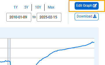
To change graph and line settings, click the “Edit Graph” button above the graph.
In the pop-up box that appears, click the “FORMAT” tab to display the changeable settings. Note that line settings pertain only to one series.
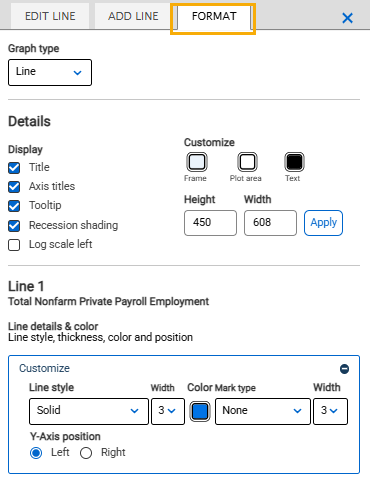
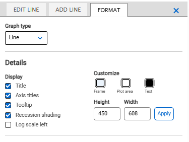
Graph settings include the following:
Graph type: Click the drop-down menu and select “Line,” “Area,” “Bar,” or “Scatter."
Display: Uncheck/check “Title” or “Axis titles” to remove/add titles. Uncheck/check “Tooltip” to remove/add the hover-over box that appears when the cursor is in the plot area.
Recession bars: Click the drop-down menu and select “On” or “Off” to add or remove recession shading.
Log scale: Click the “Log scale left” box to change the vertical axis to log scale.
Customize: Click the “Graph frame,” “Plot area,” or “Text” box to reveal a pop-up pallet of colors. Click the color you want to apply to the given option.
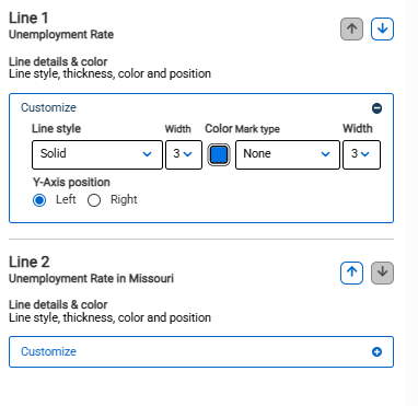
Line settings include the following:
Line style: Click the drop-down menu and choose “Solid,” “Dash,” “Dot,” or “Dash Dot.”
Width: Click the drop-down menu and choose from 1 to 5 to adjust the thickness of the line. Select zero if you would like to have no line and prefer mark-type plots (with shapes).
Mark type: Click the drop-down menu and choose “None,” “Circle,” “Square,” “Diamond,” “Triangle Up,” or “Triangle Down.”
Width: Click the drop-down menu and choose from 1 to 5 to adjust the thickness of the mark.
Y-Axis position: Click “Left” or “Right” to change the location of the Y-axis.
Move up and Move down: Click arrows on the right to adjust the order in which the lines appear on the top of the graph.