There are three convenient options for changing the observation period shown in a graph.
Option 1: Above the graph, click one of the range options: “1Y” (1 year), “5Y” (5 years), “10Y” (10 years), or “Max” (which is the maximum range of the data). The graph will update automatically.
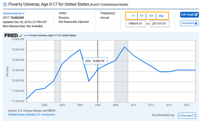
Option 2: Above the graph, click either the beginning or ending date field. You can either provide an exact date (in the YYYY-MM-DD format) or select one from the drop-down menu. The graph will update automatically.
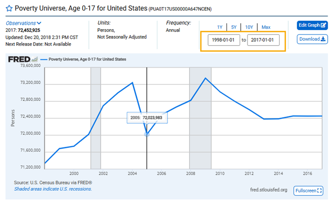
Option 3: Click and hold anywhere on the plot area of the graph and then drag the cursor to highlight the period you want to show. The graph will update automatically to show only the section you highlighted.